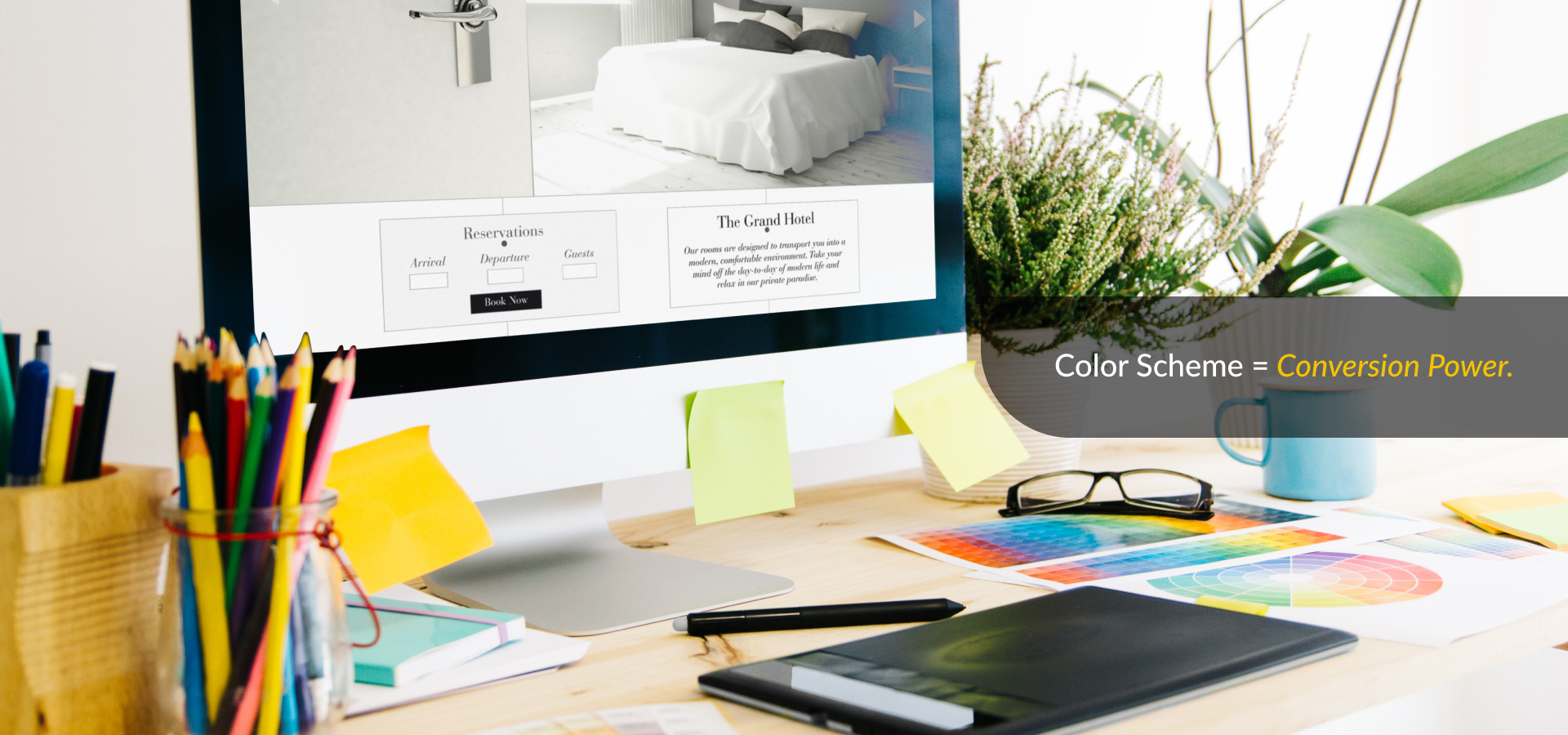
Have you ever bounced from a website in seconds? Often, it happens before reading any content, and the main reason is the color scheme and color psychology in web design. This reaction isn’t just personal taste; it’s color psychology shaping how users experience your site.
Three Seconds to Win or Lose
People judge your website almost instantly. Their brains process visual information at lightning speed, deciding about trust, credibility, and whether to stick around. Color dominates this split-second decision.
Recent Adobe research shows consumers frequently choose one brand over another based purely on color preferences. Younger audiences especially make these snap judgments in our visually saturated world.
Colors Drive Sales
The connection between color choices and actual revenue is stronger than most realize. Strategic color decisions boost conversion rates significantly. Companies optimizing their color schemes see substantial improvements in user engagement.
One famous example: a business changed its call-to-action button color and conversions jumped over 20%. Another made strategic checkout color adjustments, and completion rates climbed immediately.
This happens across industries. Thoughtful color implementation delivers measurable results affecting site engagement, brand trust, and customer conversion.
How Color Psychology Influence Behavior
Colors affect people because they trigger emotions in the brain. They shape trust, urgency, and action.
Blue – The Color of Trust
Banks, tech firms, and healthcare brands use blue because it feels safe and professional.
Red – The Color of Action
Red creates urgency, grabs attention, and even raises heart rate. That’s why it’s common in sales and alerts.
Green – The Color of Growth
Green signals health and progress. “Go” buttons are green, and finance apps use them for positive balances.
These patterns show why specific colors work better for different types of businesses.
Mobile Reality Check
Many designers chase desktop perfection, but wonder why mobile users vanish, and the subtle colors they love disappear for someone squinting at a phone in sunlight. High contrast isn’t optional anymore: SQ Magazine reports U.S. web traffic is nearly even (47% mobile vs. 50% desktop), while globally mobile leads with about 62%.
Demographics Matter
Men often lean toward intense, bold colors, while women are more likely to choose softer shades. Preferences also shift with age; what appeals to a teenager may not appeal to someone older.
Culture adds another layer. Colors don’t mean the same thing everywhere. A color associated with luck or success in one country may indicate warning or danger in another. That’s why global businesses must research carefully before deciding on a color palette.
Deadly Color Mistakes
Some design choices push visitors away, harsh color mixes raise bounce rates, while poor contrast makes content hard to read.
Too-bright backgrounds, low contrast, and excess colors hurt design. Orange and yellow work best as accents, not main shades.
Brand Recognition Through Color
Consistent colors build recognition and trust. Repeating the same shades makes your brand easy to spot and remember.
Successful brands have easily identifiable colors. That’s strategic consistency paying long-term dividends through customer loyalty and recommendations.
Your Action Strategy
Improving your color strategy starts with knowing your audience. Test a few options for things like buttons and menus to see what feels right. Keep accessibility in mind as well; strong contrast makes it easier for everyone to use your site. Pay attention to your analytics and notice how people react, then adjust when needed. Most of all, let the colors play a supporting role. They should quietly build trust and guide action while your content does the talking.
Power of Color in Business
A shade that works perfectly for one brand might not work at all for another, which is why testing matters. Even minor color adjustments can change how people react. A straightforward guideline, the 60-30-10 rule, using a dominant color, a secondary color, and an accent, helps create designs that feel clear, balanced, and professional.
Colors also set expectations. Finance brands often use blue to signal trust, while bold companies may choose different palettes to stand out. In every case, colors quietly influence emotions, trust, and buying decisions.
Colors are always at work on your site. The right palette builds trust and drives clicks, while the wrong one pushes visitors away. Great Impressions helps brands turn color psychology into a real advantage.


