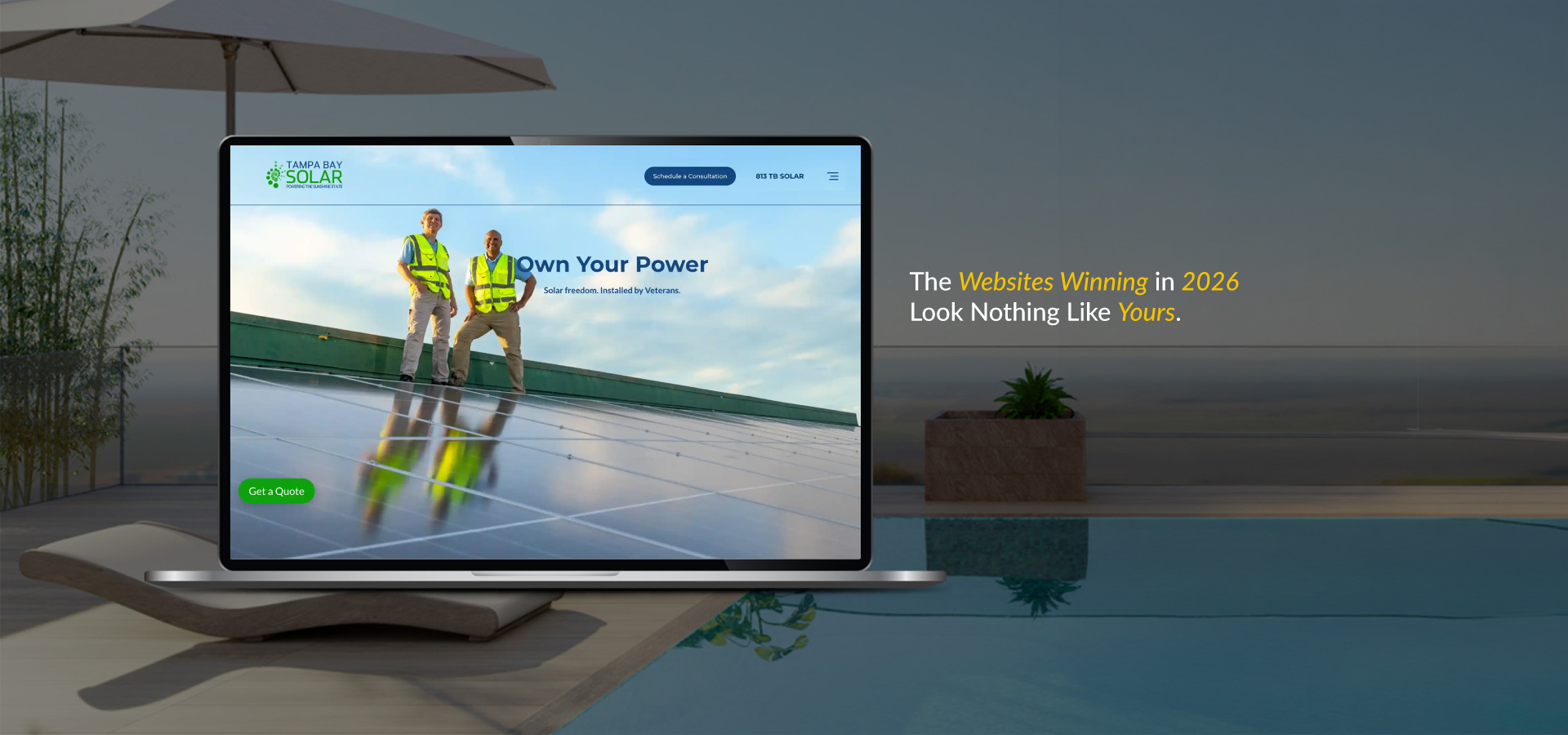
When creating a website, many people believe that adding numerous texts, images, and buttons enhances its quality. However, in reality, good web design is more about keeping it simple and eliminating unnecessary elements.
White space, sometimes referred to as negative space, refers to the empty area between elements on a page. It is around text, pictures, and buttons. It looks empty, but it is beneficial. Using white space well can change a busy website into one that is clean and simple to use.
What White Space Actually Is
White space doesn’t have to be white; it can be blue, gray, or even have a subtle pattern, which is why some refer to it as negative space. The point is that it’s unmarked, with no text, images, or clickable elements present.
You’ll find white space everywhere on good websites. The margins running down the sides of your page are white space. So are the gaps between paragraphs, the area around your logo, and even the tiny spaces between letters in your headlines. All these empty spots work together to make your design feel organized.
Why White Space Matters So Much
White space does serious work behind the scenes. Here’s what it accomplishes:
It makes reading effortless: Dense blocks of text tire people out quickly. When you add space between lines and paragraphs, reading becomes exciting instead of boring. People actually finish reading your content instead of skimming past it.
It naturally directs attention: A crowded page confuses visitors. They don’t know where to start or what’s most important. White space acts like a spotlight, guiding eyes toward your key messages and main actions without forcing anything.
It creates a professional impression: Websites with breathing room feel trustworthy and polished. They signal that you’re confident enough not to bombard visitors with everything at once. People instinctively trust clean, uncluttered designs more than those with a busy appearance.
It organizes information clearly: Without space separating different sections, everything blurs together. White space creates visual breaks that show how pieces of content relate to each other, helping visitors navigate logically through your pages.
It increases button clicks: When your essential buttons have clear space around them, they’re hard to miss. A “Subscribe” button surrounded by emptiness gets clicked far more often than one squeezed between other elements.
Practical Ways to Use White Space: How to use White Space in Web design
Ready to put white space to work? Here are specific strategies you can use right away:
Think small and big: White space comes in two types: small (such as line height, letter spacing, and button padding) and large (gaps around sections, images, or headers). Small spaces improve readability, while large spaces add structure and organization.
Find your balance: Finding the right amount of white space takes practice. Too little makes a site look crowded, while too much makes it feel empty. Aim for a balance that keeps things clear and easy to read. If unsure, it’s better to use a little more space than less.
Create a visual flow: White space helps guide visitors on your site. Extra space above a headline makes it the starting point, spacing around buttons highlights the action, and gaps between elements show the reading order.
Give buttons breathing room: This deserves special attention. Your call-to-action buttons need proper white space around them. Avoid trapping them between paragraphs or crowding them with other elements. A “Get Started” button with clear space on all sides practically demands to be clicked. The same button wedged into a busy section gets overlooked.
Design mobile-first: Phones have tiny screens, which makes white space even more critical. What looks fine on a desktop can feel cluttered on a mobile device. Increase your font size for small screens. Add extra space between clickable elements to allow people to tap accurately. Break long paragraphs into shorter chunks. Test your mobile design carefully; most of your visitors are probably using phones.
Start Simple
You don’t need to redesign everything from scratch. Pick one improvement and implement it. Add 20 pixels of space around your main button. Increase the gap between your paragraphs. Widen your page margins. Make one change at a time, save it, and look at the difference.
White space makes websites better. It helps people read, move around easily, and enjoy the site. Great Impressions uses white space to create designs that feel clear, simple, and engaging.